
Image Gallery Page 3
Gallery 3
Page: 1 | 2 | 3 | 4 | 5 | NEXT
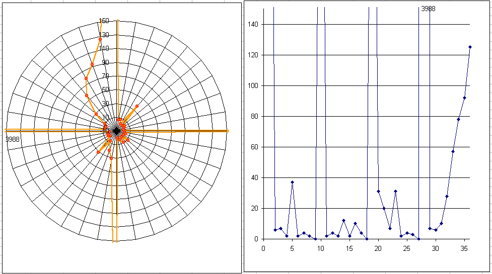
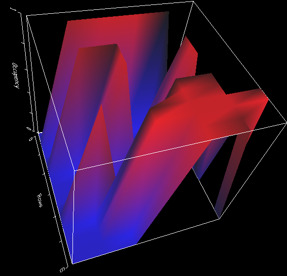
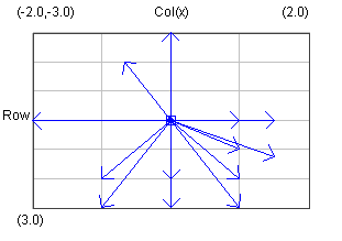
 Image 21 - Compass Direction of outgoing references. (259 test spreadsheets)
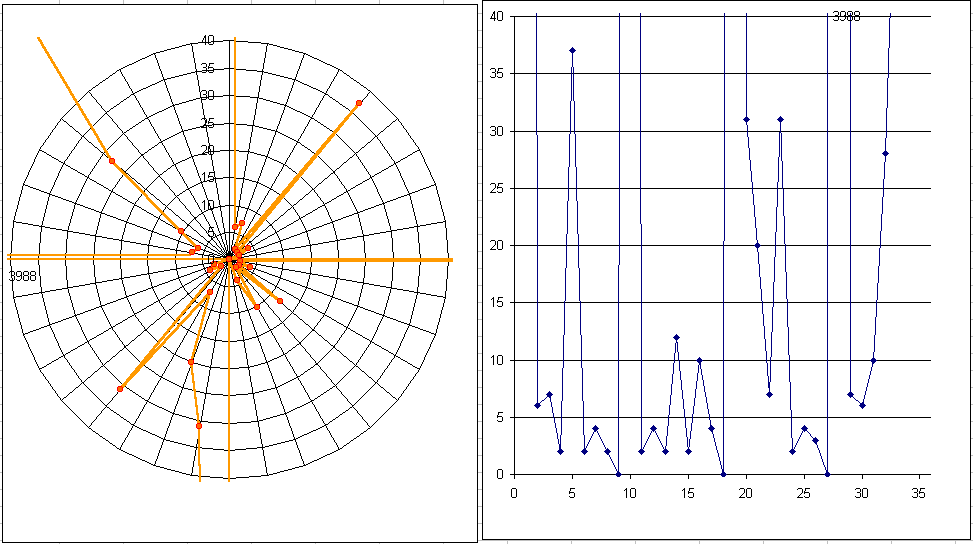
Zooms with max value at 550, 150, 40.
I figured out why the blip in the outgoing vector direction exists. It probably comes from the Summation of the column above and the rows to the left.
Note: the actual graph is generated in Excel from comma seperated data saved by the toolkit.
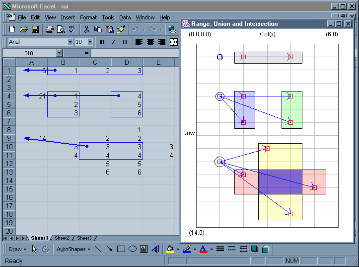
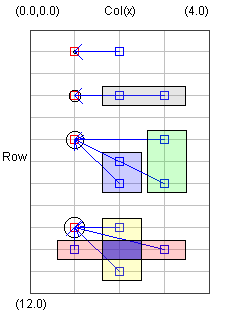
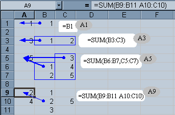
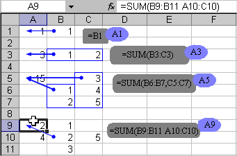
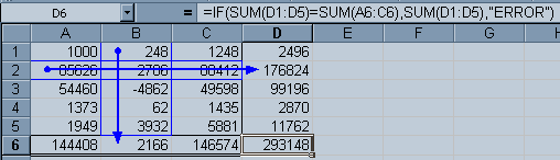
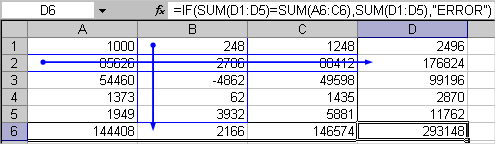
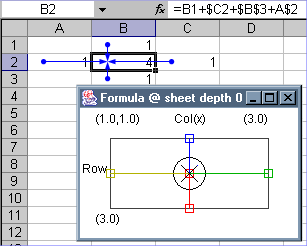
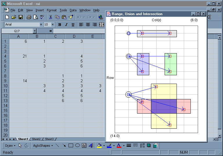 Image 22 - An Example of a Range, Union and Intersection in a single sheet.
All three circles on the left are SUM functions. The circle around them respresents the String length of the formula for that cell.
The highest Function is clearly over a range. The middle is the union of the left and right ranges. The lowest is the intersection of two ranges.
All cells actually referenced are shown using vectors.
This style of diagram is similar to that already present in Excel that can be achieved using the auditing trace tools. rui-FormulaTrace.png shows the relation to Excel's Trace function.
The occupancy diagram is not particullary exciting.
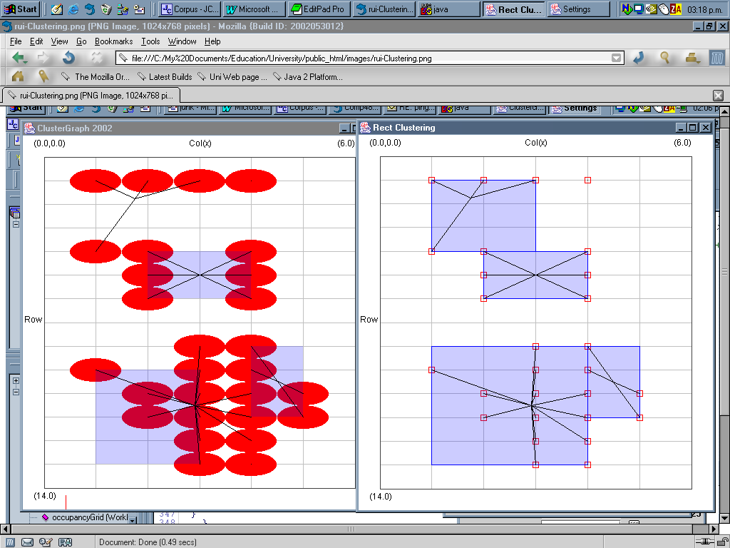
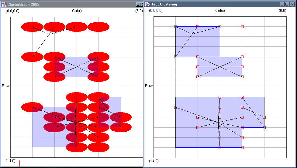
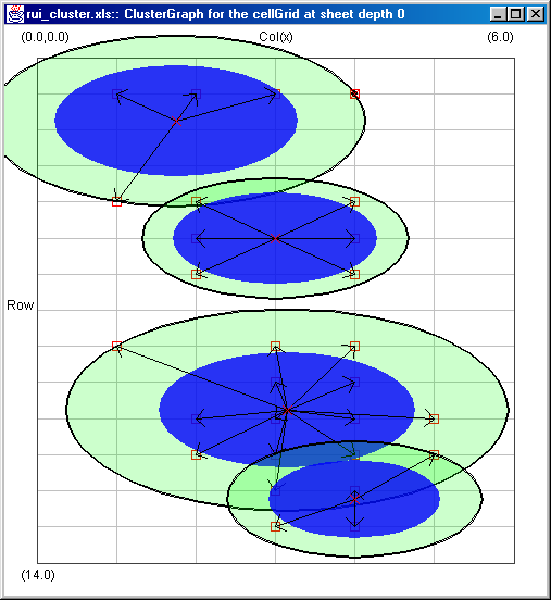
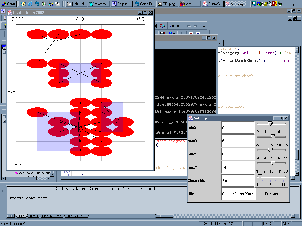 Image 23 - Experimental BIRCH Clustering.
Some experimental Clustering work.
rui-Clustering2.png (Cropped) is a comparrison of the newer version with the old.
ruiCluster_Cluster.png
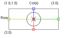
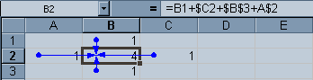
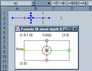
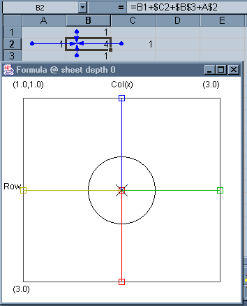 Image 24 - Absolute and Relative Formula precendents.
The main four possible types of intercell reference.
Blue is pure relative, Red is pure absolute, Green is absolute on the column and relative on the row, and Yellow is relative on the column and absolute on the row.
The large circle is as usual the length of the formula string.
 Image 25 - Images for AUIC Paper.
The following are images for use in the AUIC paper.
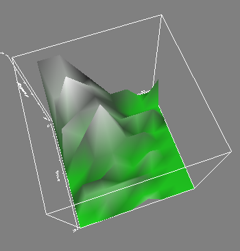
- Figure 1. Cell Occupancy in 2D
- Figure 2 (2). Cell Occupancy in 3D
- Figure 3. Formula present in sheet 1
- Figure 4. Formula present in sheet 2
- Figure 5. Formula present in sheet 3
- Figure 6. Formula present in sheet 4
- Figure 7 (labelled) (XP). Excel view of sheet 1
- Figure 8. Excel view of sheet 2
- Figure 9. Excel view of sheet 3
- Figure 10 (XP). Excel view of sheet 4
- Figure 11. Average Dependency Vectors for all sheets
- Figure 12 (XP). Absolute and relative formula
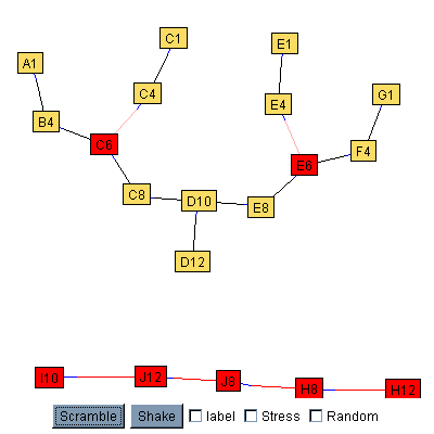 Image 26 - Precendents using spring forces for layout.
"The common 2D spring layout algorithm is based on the idea of spring forces. It automatically rearranges the
nodes and edges of a graph based on the internal structure of the graph, i.e. if two nodes are connected they
are attracted to each other, otherwise they are pushed apart. If the algorithm is iterated a few times, the
graph reaches a stable position and does not move anymore. ... Using this, the nodes (i.e. software entities)
which are central to the application will move to the core, while obsolete or barely connected nodes are pushed
to the edge."
[Michele Lanza]
The great thing about this diagram is that the cells are no longer bound by their spatial location. It would be
interesting to see if spatially similar cells remain close.
Red nodes have been locked in place and aren't free to float (but still apply forces). This is useful when
two disconnected graphs exist.
Would be interesting to start the cells at their actual spatial postions rather than randomly.
Based on code from Java Development Kit (JDK) Graph Layout demo.
This particular example uses the same spreadsheet as Image 16.
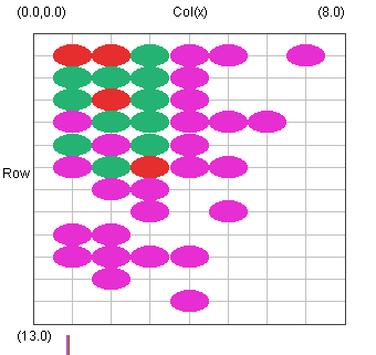
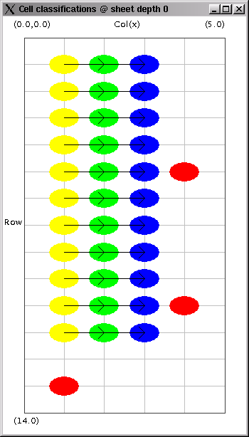 Image 27 - Cell Classification.
This visualisation is designed to give an overview of the position of each cell in the formula trees. Occupied
cells are coloured according to a simple classification system.
Yellow - Input.
Green - Inbetween.
Blue - Final.
Red - Orphan.
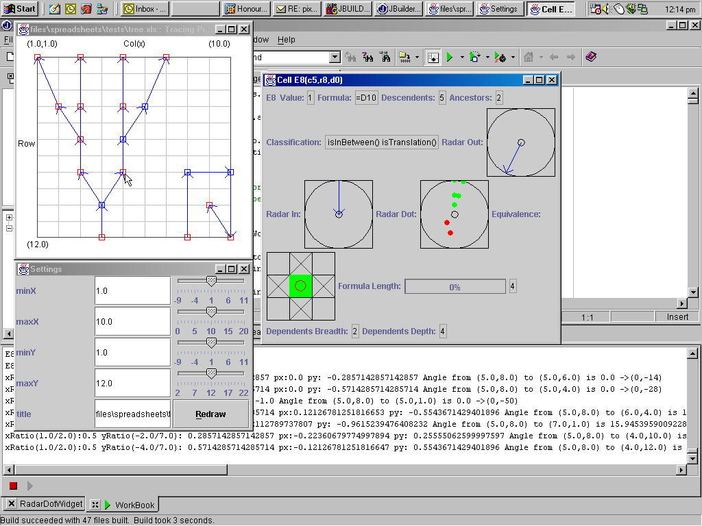 Image 28 - Cell Visualisation.
Clicking on a cell in a visualisation such as precedent tracing will display a frame containing several smaller
visualisations for that cell as well as other additional information.
Radar in/out show the directions of cells that refer to or are refered from the cell of interest respectively.
The Radar dot visualisation shows the direction and relative distance of all descendents(green) and ancestors(red) of the cell.
The equivalence visualisation shows the cell classification in the center of the cross. The adjacent boxes show the equivalence class of the immediatly adjacent cells with respect to the center cell. In the case of this visualisation the crosses show that all surrounding cells are empty.
Note: This visualisation is still in the prototyping phase, and a proper layout manager hasn't been considered.
 Image 29 - Animated Dependencies.
This diagram shows the dependency flow through the tree strucutre. Animation starts from the root cells and
traces up towards the leaf cells. Red circles help show the dependency direction.
Related to this type of diagram is the work of Igarashi [FVSS](Animated Dataflow Structures).
This particular example uses the same spreadsheet as Image 16.
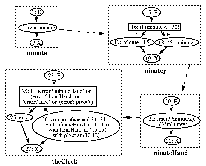
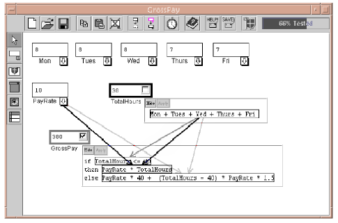
 Image 30 - Forms/3.
NOT MY WORK. Screen shoots from papers about forms/3 by Margaret Burnett. [MMB]
Page: 1 | 2 | 3 | 4 | 5 | NEXT