
Image Gallery Page 2
Gallery 2
Page: 1 | 2 | 3 | 4 | 5 | NEXT
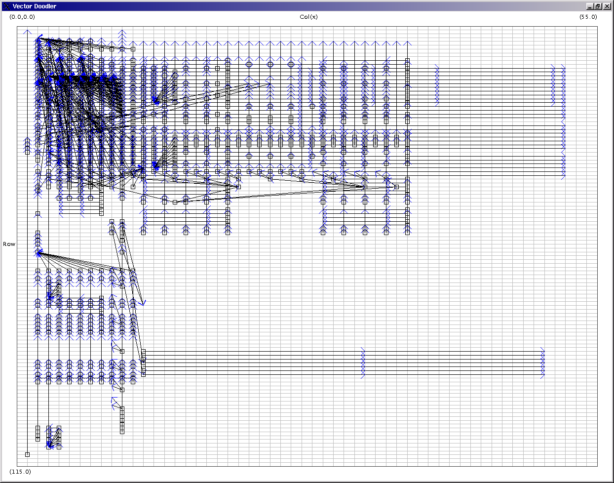 Image 11 - The average dependeny vector from a corpus of fiscal spreadsheets.
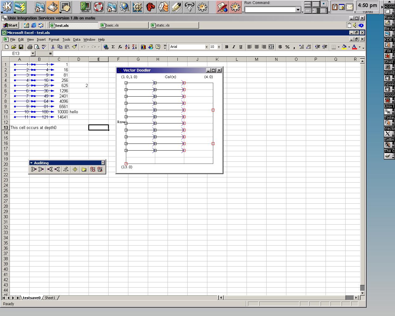
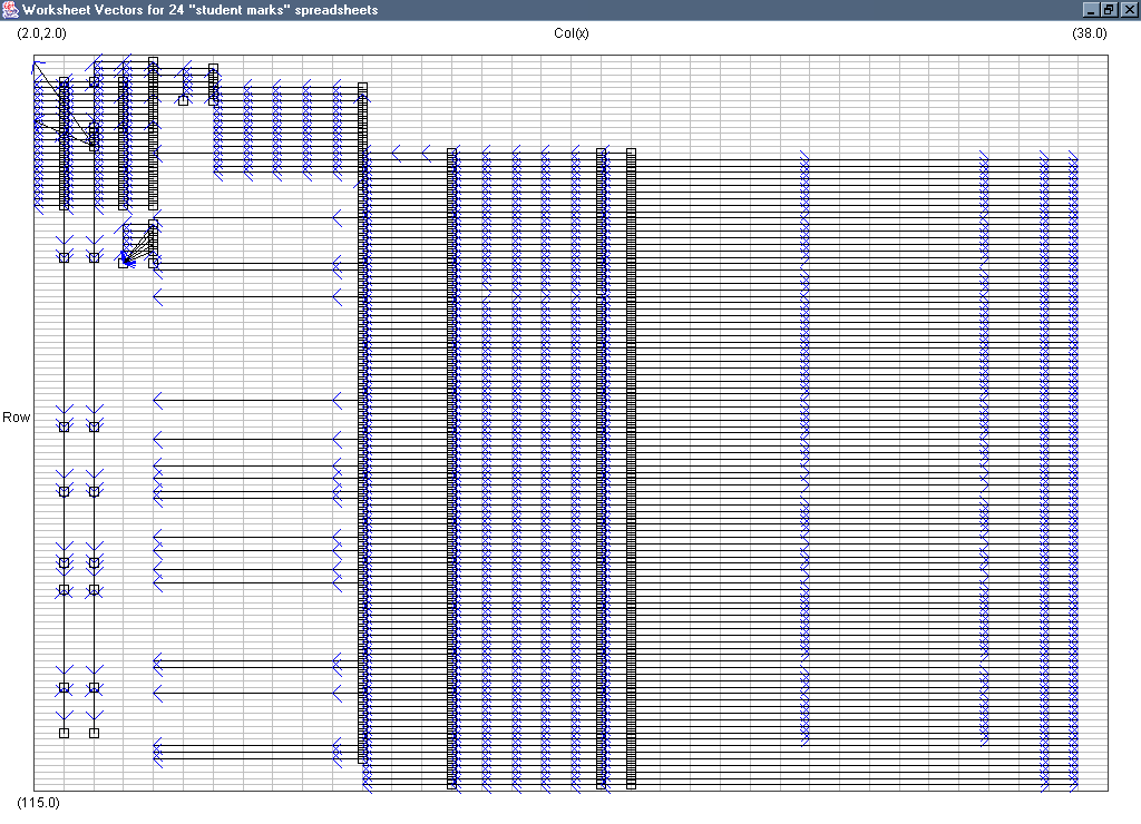
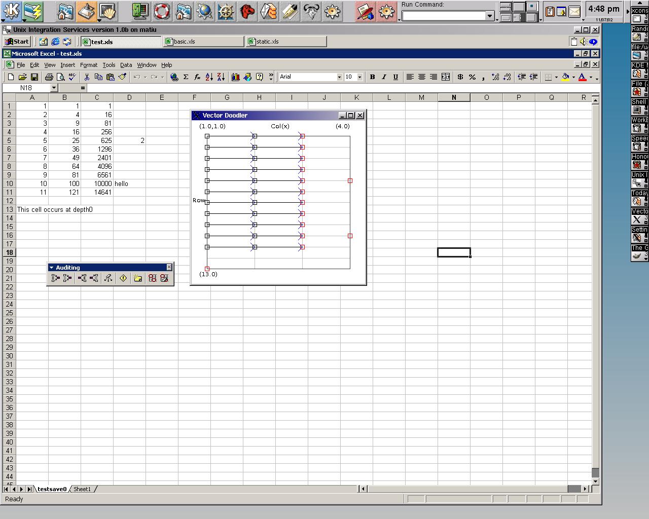 Image 12 - Displaying the dependencies in a single worksheet.
Here (testxls_arr.jpg) is the data except that Excel has marked the dependencies using the auditing tools.
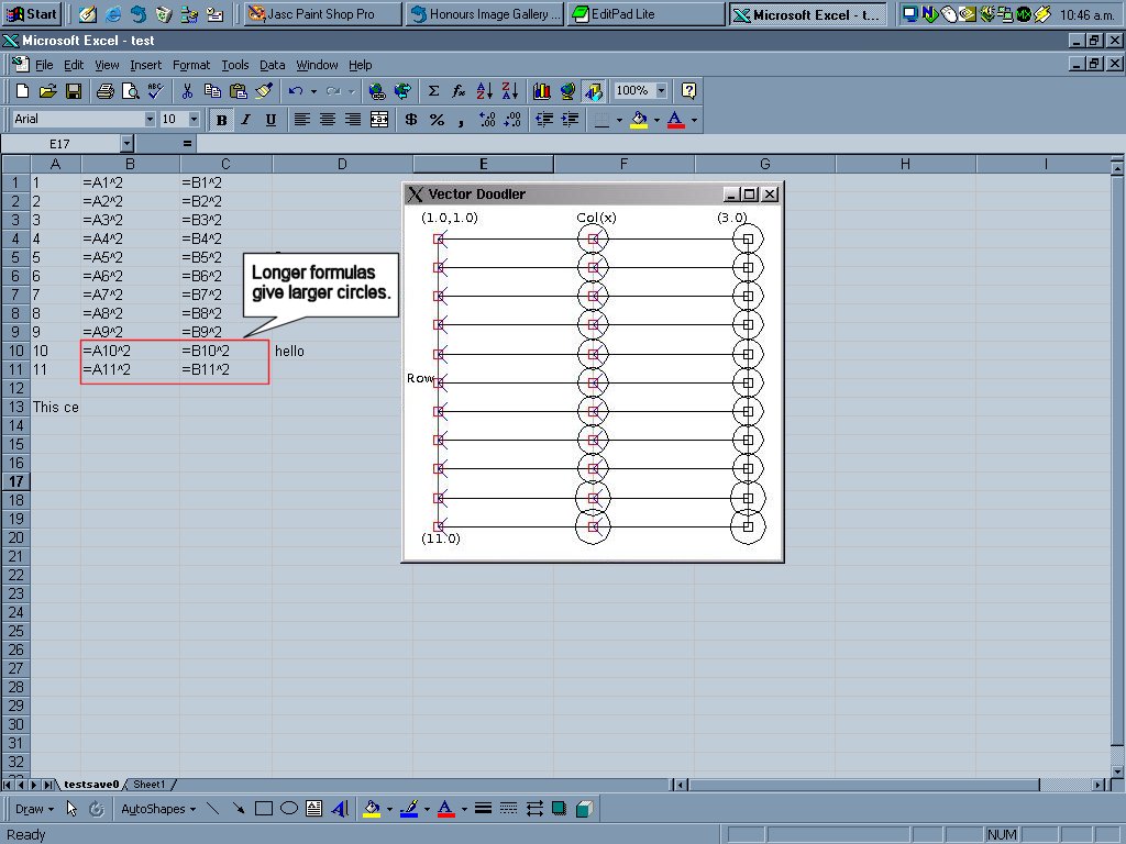
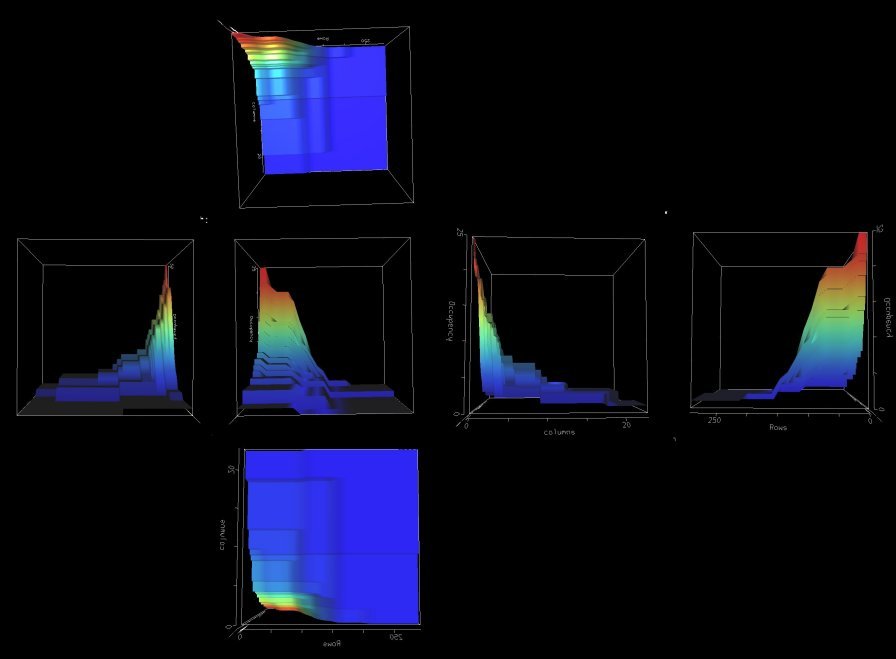
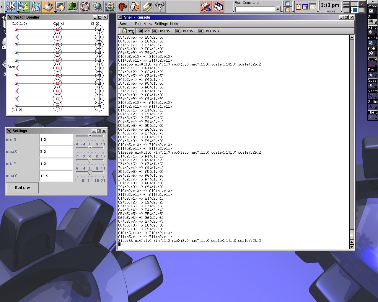 Image 13 - The average dependeny vector from a corpus of fiscal spreadsheets.
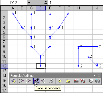
The spreadsheet formulas can be seen here. Note that pressing Cntl-~ in Excel will toggle between value and formula display modes.
The use of circles to depict complexity does not seem to scale well. Especially in the case of a large range of complexities.
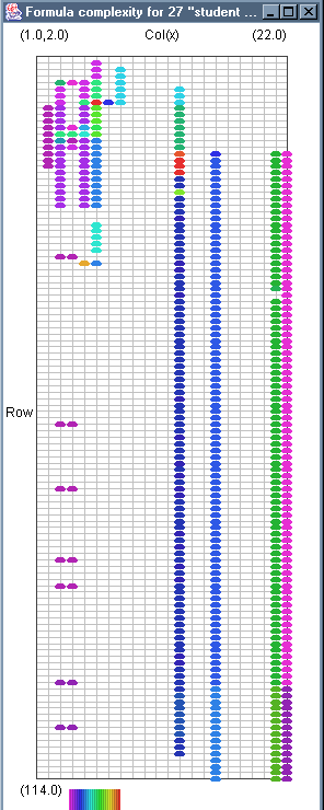
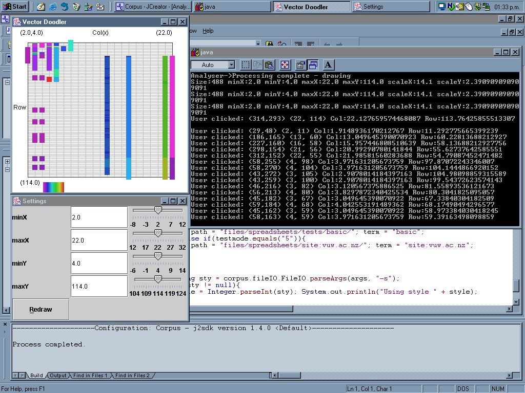 Image 14 - The formula complexity from a corpus of "student marks" spreadsheets.
There is a problem here with the overlapping of data. This is addressed by moving to sized circles.
A version using the new display mode is here.
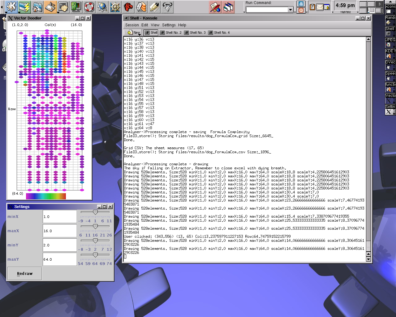
Another good picture was taken using spreadsheets related to dogs.
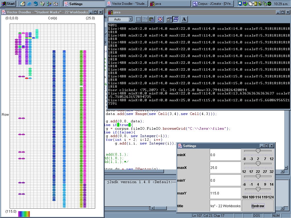
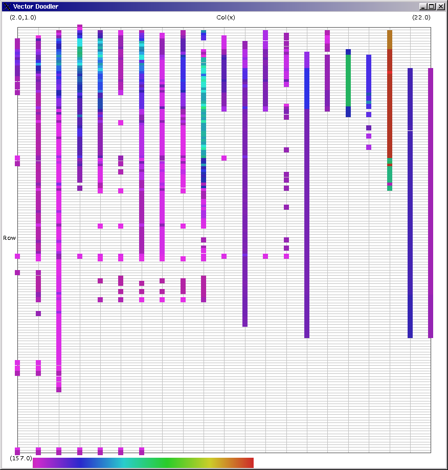 Image 15 - Formula complexity by position for 116 workbooks with "student marks" keyword.
The complexity here is based on the length of the formula, as a string. For each cell the total of all the complexities is totalled.
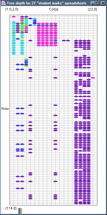
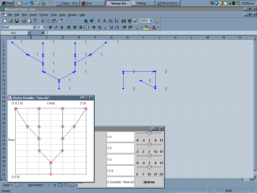 Image 16 - An example of a tree in a spreadsheet.
Here the root nodes are searched for, then the dependency tree drawn using DVector.
Note: the data being used was created to test the drawing of trees. Excel98 can be seen in the background with the auditing tools used to give a similar trace.
Another version of the tree can be seen in tree_xp.png, which was rendered in ExcelXP.
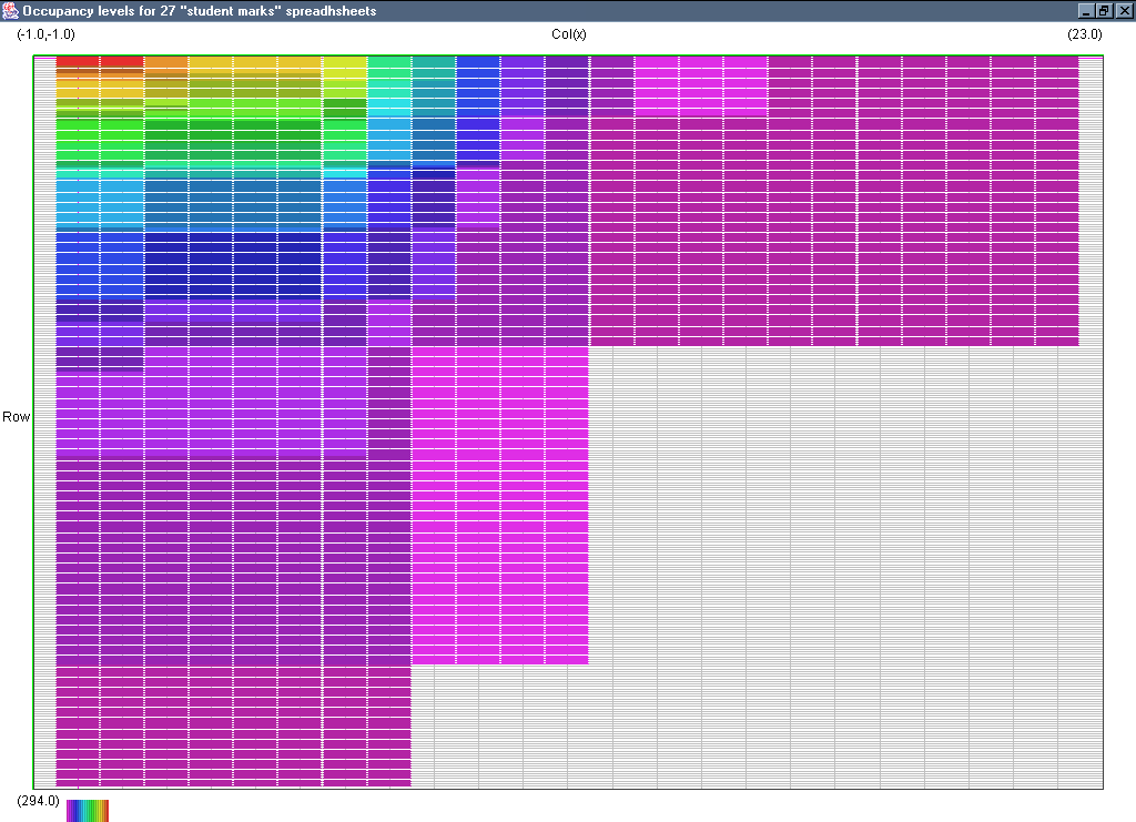
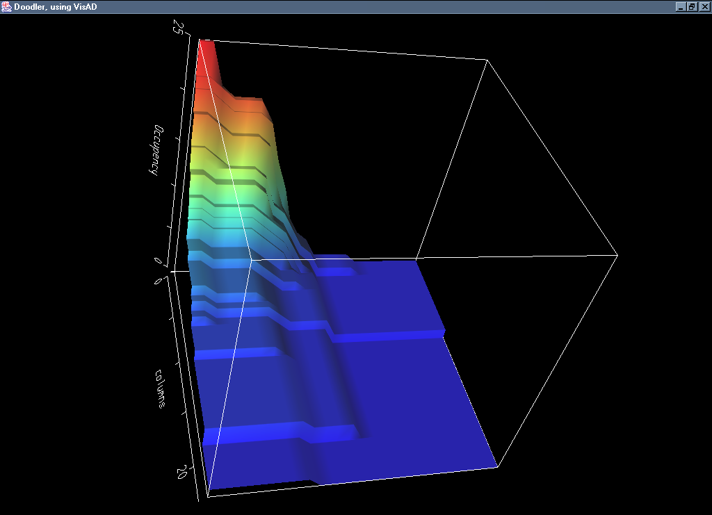 Image 17 - Cell occupancy of 27 student marks spreadsheets.
The collection of images:
- Visad occupancy
- Visad orthographic view of occupancy (3rd scale)
- occupancy plan
- vector
- formula complexity
- tree depth
Notes to self: Check on differences in column width and row height to ensure correctness of views.
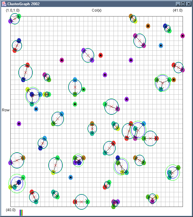
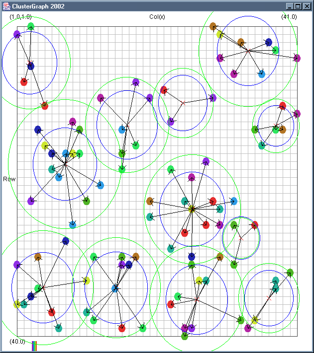
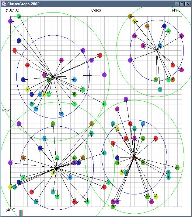
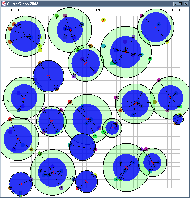
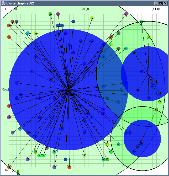
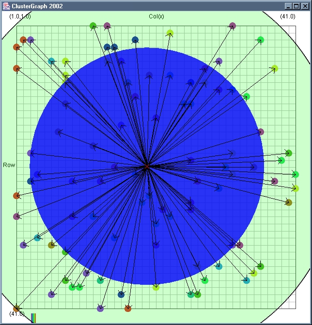
 Image 18 - Clustering using ClusterGraph.
Note: The main animated gif is 233K.
Still using comlpetely made up (in this case random) data.
The outer green circle should be the maximum radius while the inner blue circle is the average radius. Note that
a cluster element can only be added to a cluster if the average cluster radius stays below the user defined
maximum. This can have some strange affects. If there in an extremely dense clump of data a few cluster records
at a larger than expected distance can be included.
The solid colour circles are integers with a random value.
It might be interesting if I can combine the clustering information with the actual dependency structures that exist.
Cluster Radius
2,
3,
4,
5,
6,
7,
8,
9,
Animated
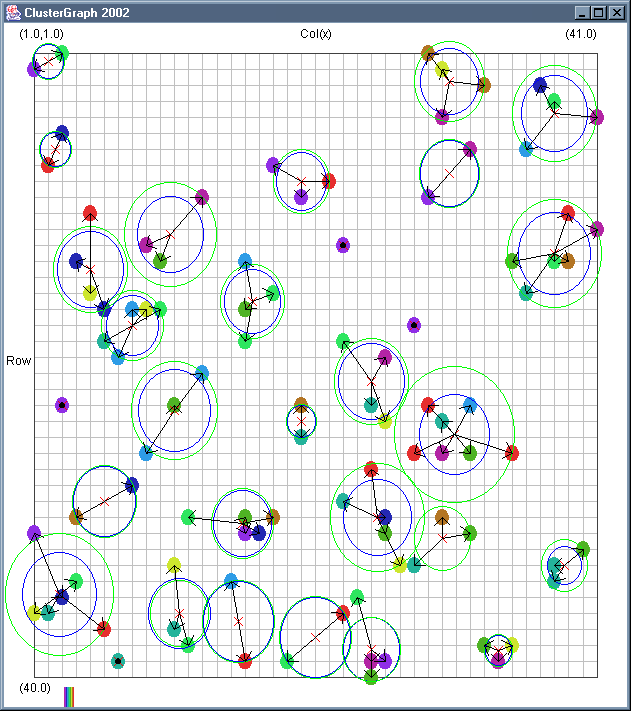
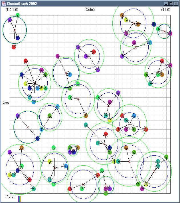
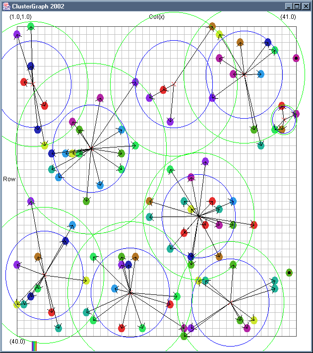
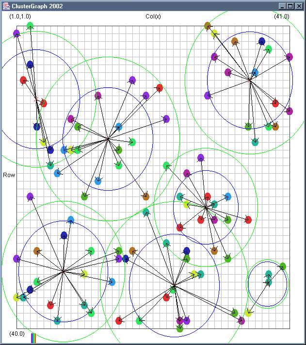
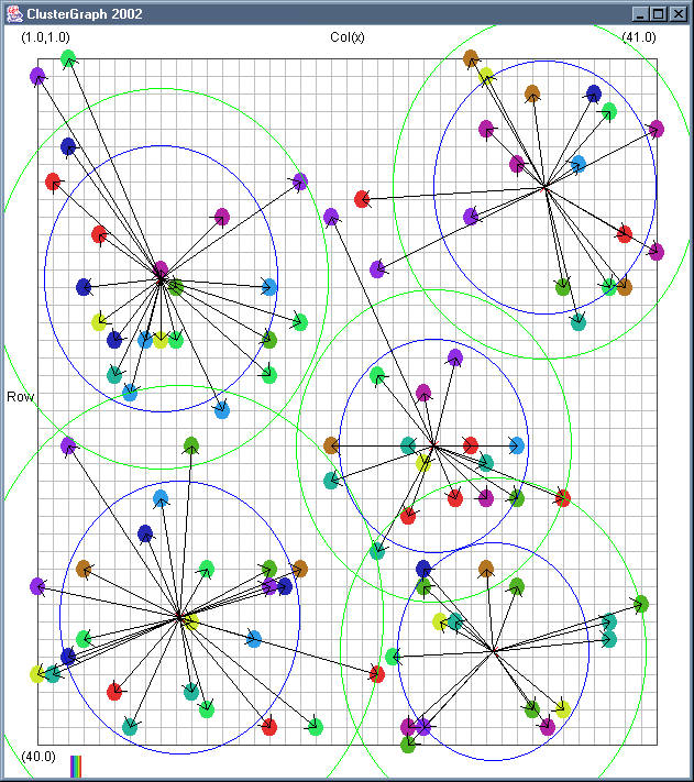
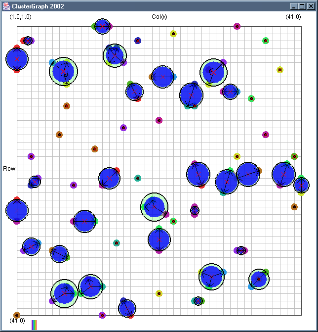
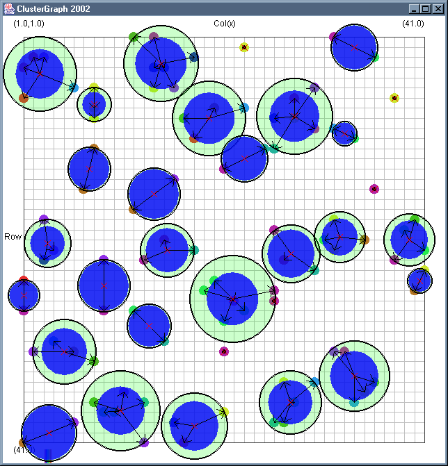
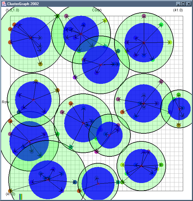
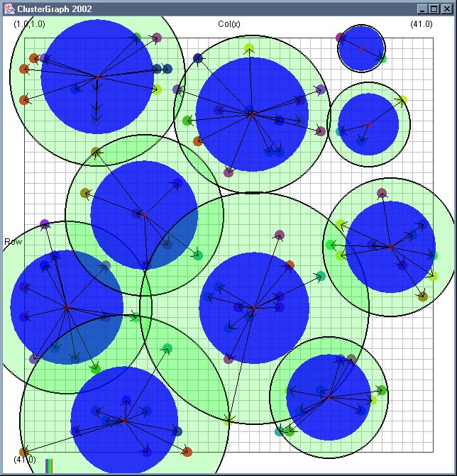
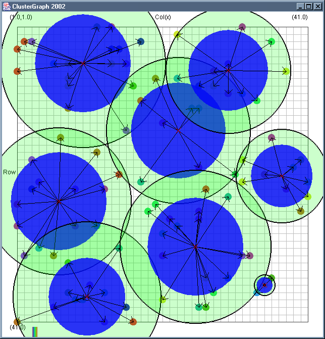
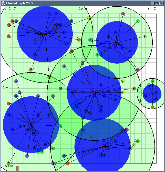
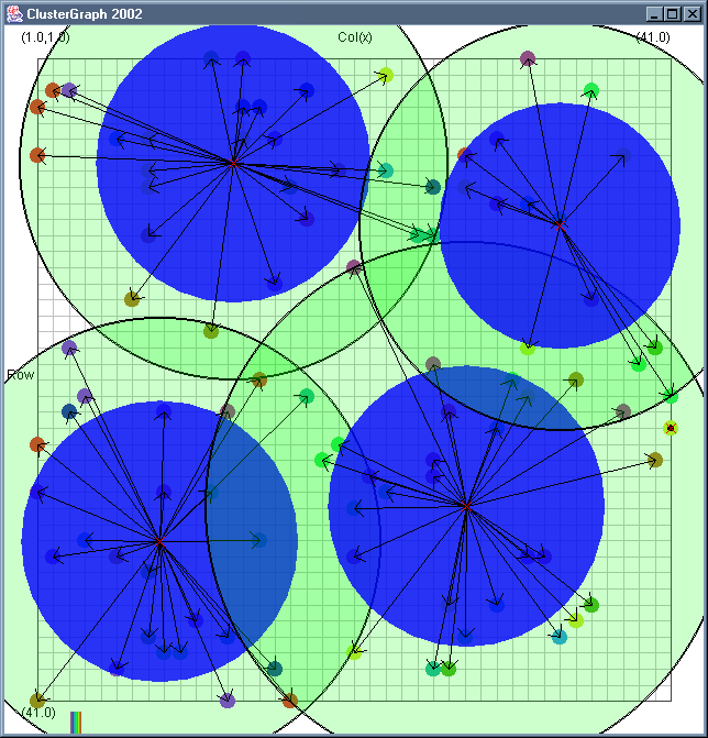
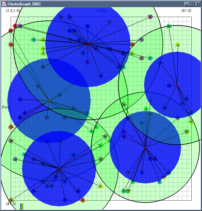
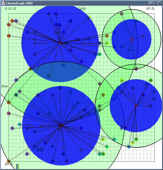
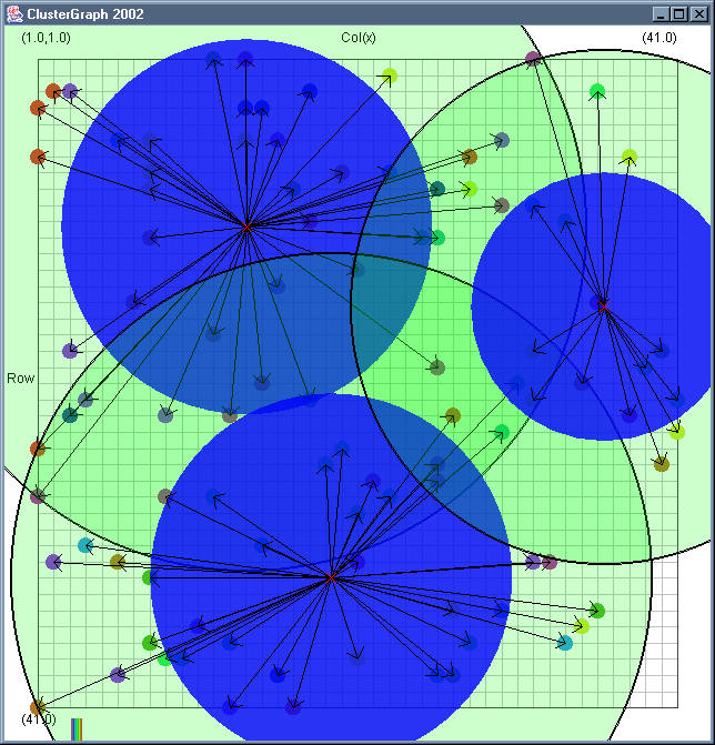
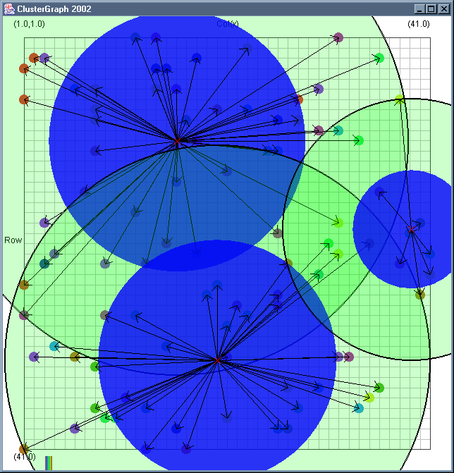
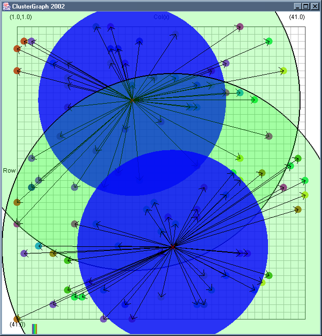
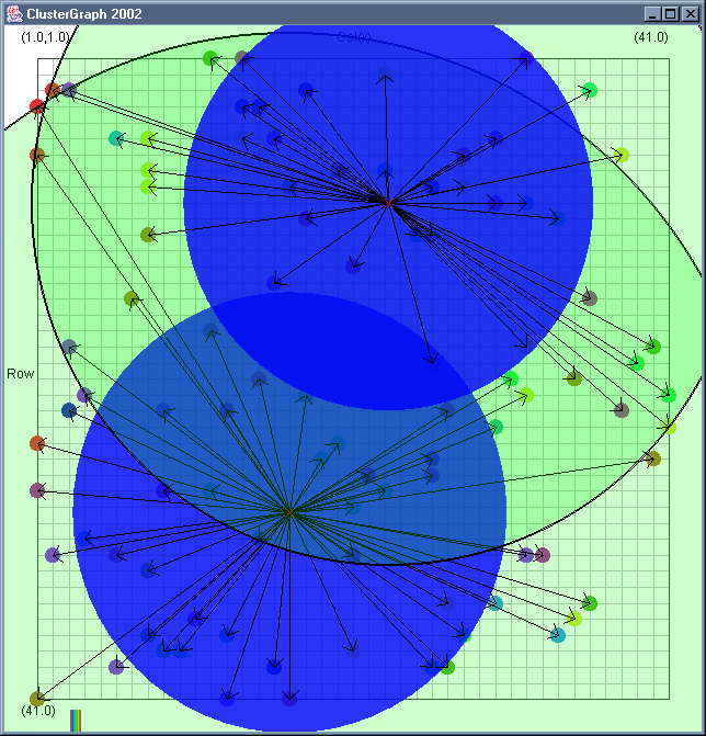
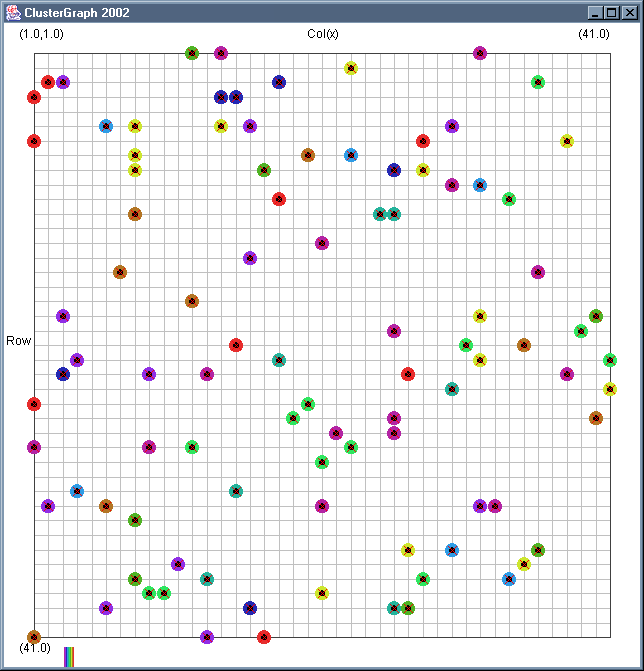 Image 19 - Clustering using ClusterGraph version 2.
Note: The main animated gif is 773K.
Doing much the same stuff as Image 18, but fixed the maximal cluster radius and added transparent colours.
Cluster Radius
1,
2,
3,
4,
5,
6,
7,
8,
9,
10,
11,
12,
13,
14,
15,
16,
17,
18,
19,
animated
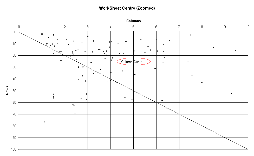
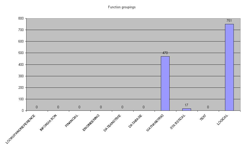
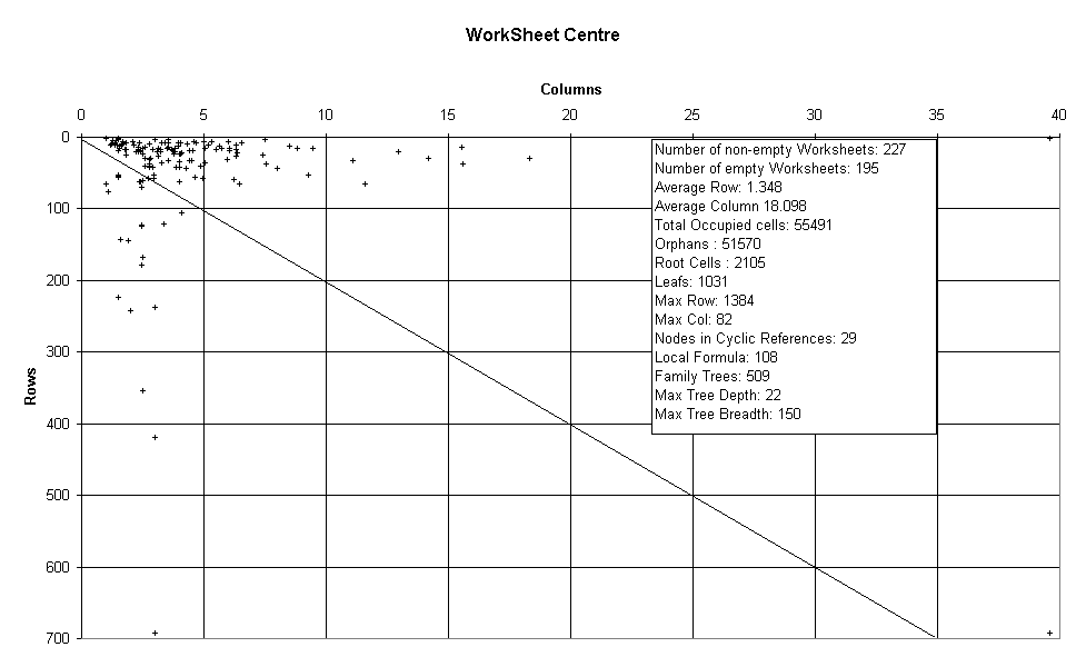 Image 20 - Metric graphs drawn in Excel :)
Metrics are produced by Analyser using the 259 testing spreadsheets and dumped out in CSV form.
In metricwsc you can see the average cell coordinate for each worksheet. The average centre tends towards being in the columns rather than the rows. A Zoom on the clump makes this clearer.
In metricfreq the distribution of function type is shown. The test sample appears to be fairly biased.
Note: the actual graphs are generated in Excel from comma seperated data saved by the toolkit.
Page: 1 | 2 | 3 | 4 | 5 | NEXT